

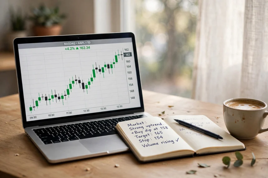
Open any finance app or trading platform and you will be greeted by a wall of numbers: prices ticking up and down, percentages in green and red, and abbreviations that seem designed to confuse. Yet a stock quote is not as complicated as it looks. Once you know what each figure means, you can judge in seconds whether a company deserves a closer look or a quick pass. This guide breaks down the anatomy of a stock quote in plain language, so the next time you check a share price you actually understand what you are seeing.
The Last Price and the Day’s Change
The biggest number on any quote is the last traded price — the price at which the most recent transaction took place. Next to it you will usually see the day’s change in both absolute and percentage terms, measured against the previous day’s closing price. A share trading at 250 that is “up 5 (+2.04%)” has gained five points since yesterday’s close. The percentage matters more than the raw number, because five points means something very different on a 50-rupee share than on a 5,000-rupee one.
Bid, Ask and the Spread
Below the headline price sit two quieter figures: the bid, the highest price a buyer is currently willing to pay, and the ask, the lowest price a seller will accept. The gap between them is called the spread. Popular, heavily traded shares have tiny spreads, which means you can buy and sell without losing much to friction. Thinly traded shares have wide spreads — an early warning that getting in or out could be expensive. The reference guide at Investopedia walks through each of these fields in more detail if you want to go deeper.
Volume: How Much Interest Is There?
Volume counts how many shares changed hands during the session. A price move backed by heavy volume is far more meaningful than the same move on a quiet day, because it shows conviction from many participants rather than a handful of orders. Many investors compare today’s volume with the average daily volume shown on the quote; a sudden spike often signals news, results or institutional activity worth investigating before you act.
The Day Range and the 52-Week Range
The day range shows the highest and lowest prices of the current session, giving you a feel for volatility. The 52-week range places today’s price in a longer context: a share near its yearly high may have momentum but little margin for disappointment, while one near its low could be either a bargain or a business in trouble. Context, not the number alone, tells you which. If you are still deciding how to build your first portfolio, our guide to ETFs vs index mutual funds explains two lower-maintenance routes into the market.
Market Cap and the P/E Ratio
Market capitalisation — share price multiplied by the number of shares outstanding — tells you the company’s overall size, which is far more informative than the price alone. A 100-rupee share can belong to a much larger company than a 2,000-rupee share. The price-to-earnings (P/E) ratio divides the price by annual earnings per share, giving a rough sense of how much investors are paying for each unit of profit. Compare a company’s P/E with its sector average and its own history rather than treating any single number as “cheap” or “expensive”. Defensive assets behave differently again, as our look at gold’s safe-haven run in 2026 shows.
Putting It All Together
A stock quote is a dashboard, not a verdict. Read the price with its percentage change, check the spread and volume for liquidity, place the price inside its 52-week range, and use market cap and P/E to size up the business behind the ticker. Do that consistently and you will already be ahead of everyone who buys because a number on a screen turned green. Research first, invest second — and let the quote inform your decision, not make it for you.